
A data summary takes every ABC report for one student over a date range and turns it into the charts and totals you bring to a meeting. This is the output most teams came to SPEDup for.
Generating one
From a student's profile, Data Summaries tab, then Generate Report. You can also generate from the Reports page.
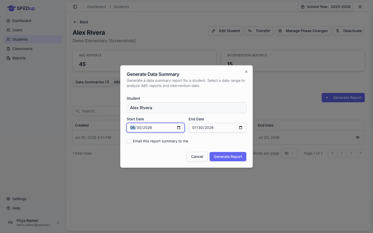
- Confirm the student.
- Pick a Start Date and an End Date.
- Generate.
It builds immediately and is saved to the student, so anyone with access can open it later without regenerating.
Picking a date range
- A grading period or quarter for progress monitoring
- The last 30 to 60 days for a team meeting about current behavior
- Since the last IEP for an annual review
- A full school year for a summary of the year
Longer is not automatically better. A range spanning a summer break or a long absence puts flat stretches of nothing into the middle of your trend lines. Use blackout dates to handle that. See Charts and data quality.
Teachers can also generate a summary from their phone, from a student's profile. It shows up here.
Reading a summary
Open a summary from the Data Summaries tab.
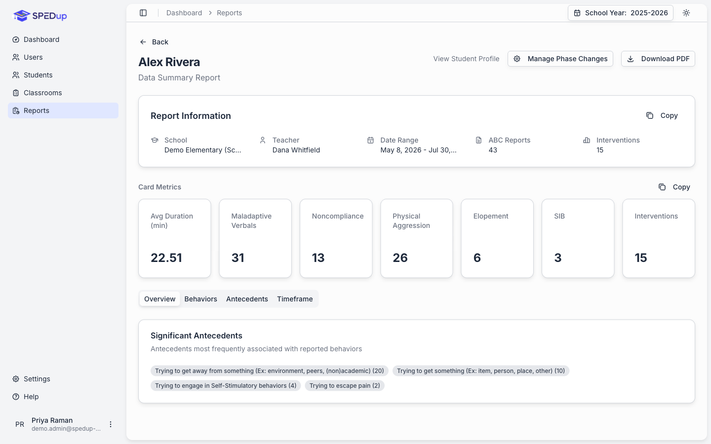
Report Information at the top: the student, the school, the teacher, the date range, and how many ABC and intervention reports went into it.
The stat cards are the raw totals for the range:
| Card | What it counts |
|---|---|
| Avg Duration (min) | Mean incident length |
| Maladaptive Verbals | Crying, screaming, profanity, teasing, arguing, threats |
| Noncompliance | |
| Physical Aggression | Hitting, kicking, throwing, biting, pinching, spitting |
| Elopement | Including running away |
| SIB | Self injurious behavior |
| Interventions | Intervention reports in the same range |
Then four tabs.
Overview
Significant Antecedents ranks the triggers most frequently associated with reported behaviors. Read this one first. It is the closest thing SPEDup gives you to a statement of function.
Behaviors
The charts live here. This is the tab you will spend the most time on.
Incident chart. Incidents over time with a trend line and an R² value. The R² tells you how well the line actually fits the data. A trend line over scattered points is not evidence of anything, and SPEDup will suppress a trend it cannot support.
Behaviors chart. The behavior categories plotted as separate lines, so you can see which one is driving the total.
Duration chart. How long incidents ran, over time. A falling incident count with rising durations is a different situation than a falling count with falling durations, and this chart is what tells them apart.
Behavior Types chart. Distribution across categories.
Daily Behavior Data, the day by day numbers behind the charts. Use it when someone asks about a specific date.
Antecedents
Graphing by Antecedents plots antecedent frequency over time with its own trend line. This is the chart that shows whether an antecedent focused intervention is working.
Timeframe
Timeframe Details buckets incidents into 15 minute intervals across the instructional day. Persistent spikes at the same time usually point at a transition or a specific activity rather than at the student.
What is excluded from the math
Weekends. Days with no school do not enter the daily series at all. They are not zero incident days. Leaving them in biases every trend line toward "improving."
Blackout dates. Holidays, breaks, and closures recorded by your district, plus any recorded by the school this summary belongs to, skipped the same way. See Charts and data quality.
Draft reports. Only submitted reports count.
Exporting
Download PDF on the summary. The PDF includes the charts as they appear on screen, rendered at high resolution, plus student, teacher, and school metadata and a confidentiality footer. It always prints on white regardless of whether you are using dark mode.
Reading a summary honestly
Check the report count before you read the charts. Six reports over three months is not a trend, whatever the line does. The charts will draw, but they are not evidence.
Check for phase changes. If the intervention changed mid range and nobody recorded it, the chart shows one continuous story where there were actually two.
Look at antecedents and timeframe together. "Trying to get away from something, clustered at 10:15" is actionable. A total incident count is not.
Duration and frequency can move in opposite directions. Both are progress in the right circumstances. Say which one you are claiming.