
The charts are only as good as the context around them. Two features exist specifically to keep them honest: phase changes and blackout dates. Both take a minute to set up and both save you from defending a misleading chart in a meeting.
Phase changes
A phase change marks the day something about the intervention changed. Started a token economy. Moved to a new reinforcement schedule. Changed the classroom placement.
Once recorded, it is drawn as a labeled vertical line on five charts: Incident, Behaviors, Duration, Behavior Types, and Antecedents. Anyone reading the data afterward can see what changed and when.
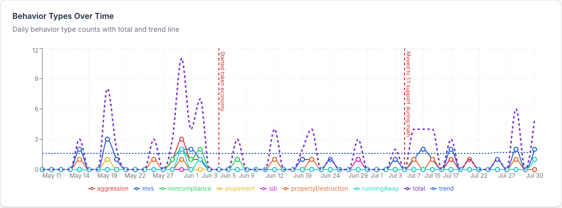
Recording one
Two ways in:
- From a student's profile, click Phase Changes. Any date is allowed.
- From a data summary, use the same option. The date picker is limited to that summary's date range.
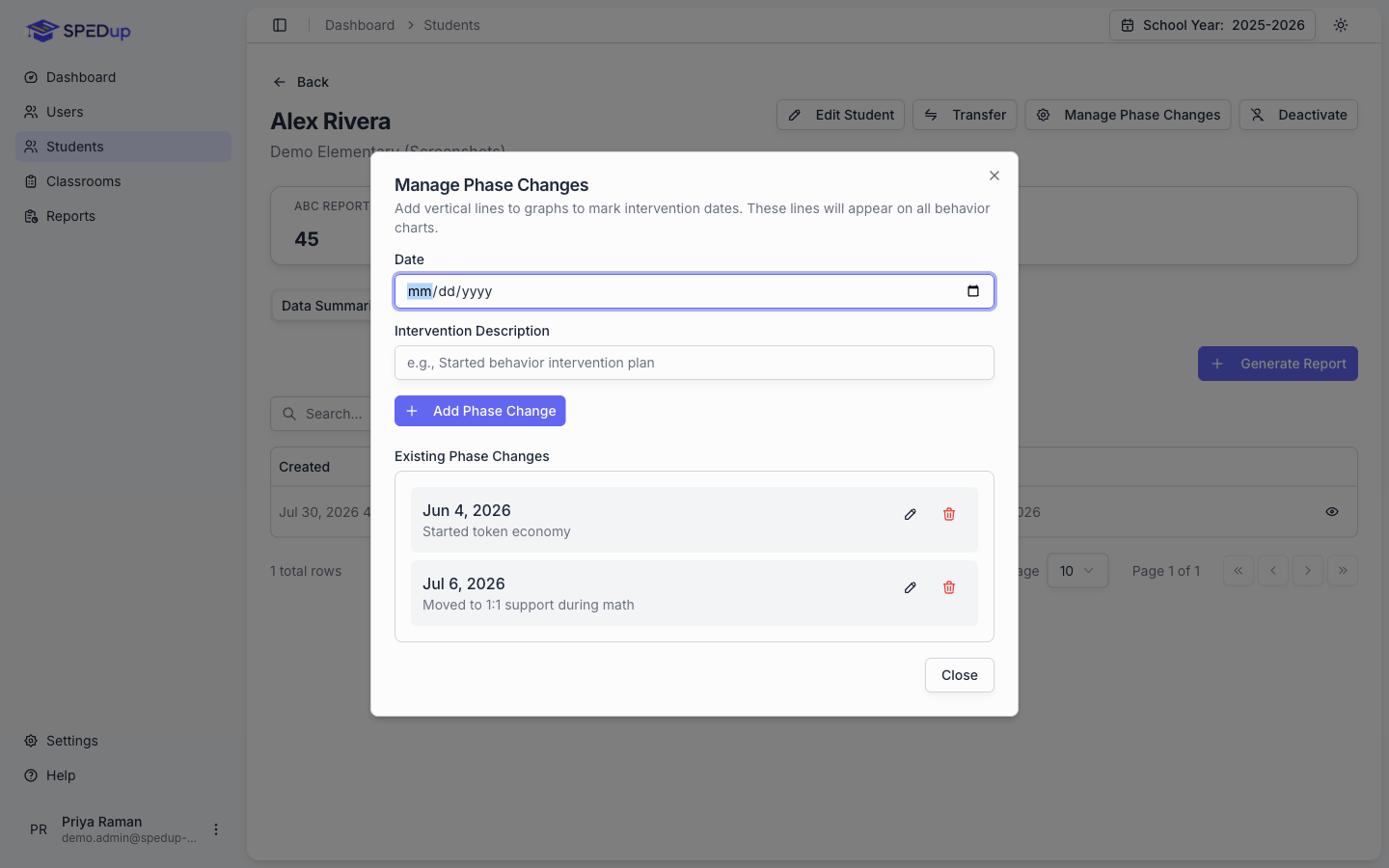
Enter a Date and an Intervention Description, then add it. Something like "Started behavior intervention plan" or "Moved to 1:1 support during math."
Existing phase changes are listed below and can be edited or removed.
What to know
They live on the student, not on the report. A phase change describes that student's intervention history, so it appears on every data summary generated for them, including ones created before you entered it. You do not have to go back and update old summaries.
Everyone can record them. Teachers, itinerant staff, administrators, all of them. This is deliberate. The person running the intervention knows when it started, and gating this behind administrator permissions would mean the people with the knowledge cannot write it down.
Duplicates are handled. Adding the same date and description twice does not create two lines.
On the chart, long descriptions truncate to fit. Hover the line to see the full date and text.
Write them as you go
Recording a phase change takes fifteen seconds on the day it happens and is nearly impossible to reconstruct six months later. Make it part of whatever your team already does when an intervention changes.
Blackout dates
Blackout dates are the days school was not in session: holidays, breaks, weather closures, professional development days.
Without them, a two week winter break enters every trend line as fourteen consecutive zero incident days, and every trend and R² in that range moves toward "improving." Nothing improved. School was closed.
Recording them
Blackout dates live in two places, and a school's list is added to its district's rather than replacing it.
District dates are the calendar everyone shares: winter break, spring break, federal holidays. Every school under the district uses them.
The district profile is not in the sidebar, so get to it through a school: Schools, open any school in the district, then click the district name on its profile. From there, use Manage Blackout Dates.
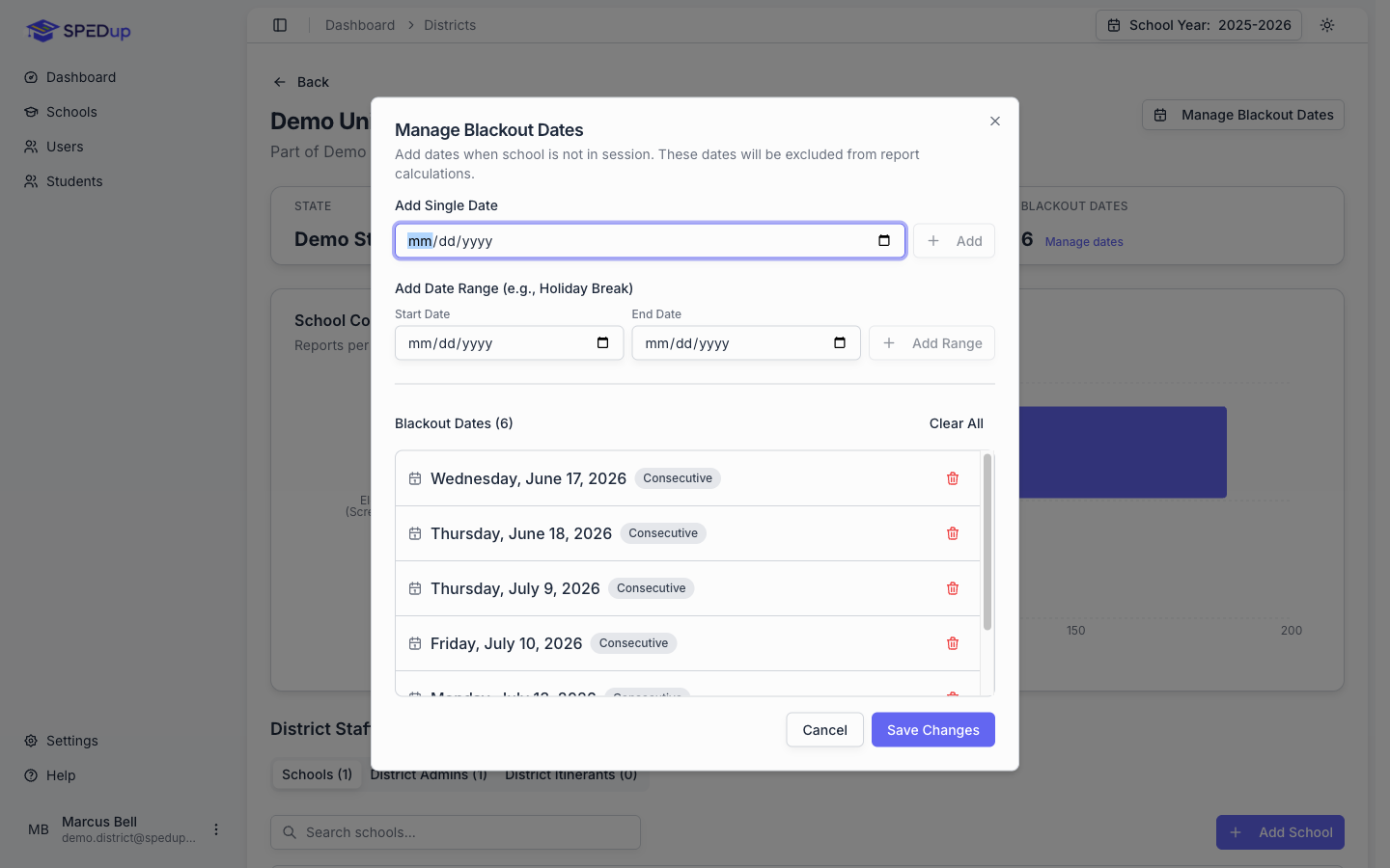
School dates are for the days one campus was closed and the rest of the district was not: a local weather day, a campus in-service, a burst pipe. Open the school and use Manage Blackout Dates there. District administrators get to it through Schools; a school administrator uses My School, which opens their own building. The dialog tells you how many dates the district has already recorded, so you are not entering the same holidays twice.
A school can close a day the district kept open. It cannot reopen a day the district closed. If a district date is wrong, fix it on the district.
Two ways to add, in either dialog:
- Add Single Date for a one off closure
- Add Date Range for a holiday break, which adds every day between the start and end
Both profiles show a count of how many dates are recorded, so you can see at a glance whether anyone has done this.
Who can record them
| District dates | School dates | |
|---|---|---|
| Super admin | Yes | Yes |
| District admin | Their own district | Any school in their district |
| School admin | No | Their own school |
What it does
A blackout day is skipped entirely, the same way weekends are. It is not recorded as a zero. It never enters the daily series at all.
School dates apply wherever the numbers belong to one school: every Data Summary, and the dashboard of anyone who works at a single school. District wide dashboards use the district list only. A chart that pools ten schools together cannot drop a day because one of them was closed, since the other nine were open and reporting.
Do this once at the start of the year
Load your district calendar in August: every break, every holiday, every scheduled closure. It takes ten minutes and it makes every chart your district produces for the rest of the year defensible. Add weather closures as they happen.
Trend lines and R²
Charts that plot data over time draw a linear trend line and report an R² value.
R² tells you how well the line fits the points. Close to 1 means the points cluster tightly around the line and the trend describes the data well. Close to 0 means the points are scattered and the line is drawn through noise.
A trend line needs at least three data points. Below that, SPEDup suppresses it rather than drawing a line through two dots.
No negative values. Counts are bounded at zero.
Quote the R² when you quote the trend. "Incidents are trending down" and "incidents are trending down, R² of 0.71" are different claims, and only one of them is checkable.
Colors
Each behavior category keeps the same color across every chart in SPEDup. Physical aggression is the same color on the dashboard, in a data summary, and in a PDF. That consistency is deliberate, so you can read a new chart without going back to the legend every time.
All palettes work in both light and dark mode. PDFs always render on white.
A quick data quality check
Before you take a chart into a meeting:
- Does the date range cover a period with enough reports to say anything?
- Are blackout dates recorded for any breaks inside the range?
- Are phase changes recorded for any intervention changes inside the range?
- Does the R² support the claim you are about to make?
- Are you reading frequency, duration, or both, and have you said which?